UX Design in Data & AI Products: How to "Show Your Working"


So, I've explored why APIs need a user experience designed for them.
I'm now moving to another area, which is slightly more visible but still pretty damn complex: presenting data.
Broadly, I will take you through:
- Why people don't trust your data/numbers yet, and why that's often rational
- Your software is just a type of delegation and what that means
- Why showing your working matters, and how that builds trust over time
- How to handle uncertainty and "black boxes" (important for ML/AI)
- Breaking systems out into layers helps people understand what you did and not to blame you when it goes wrong
- Why Being Correct™ isn't enough, especially if you are proving your user wrong
Story time

Most office or tech workers have read one of those stories that fly around on screenshots on social media that go something like this:
- I did a smart thing at work - I used a SUM in my spreadsheet so I don't have to add it all up manually!
- I was very proud and showed my boss
- My boss told me I had to do it manually anyway! So ridiculous, this is insane, my boss is a moron.
What if I told you: (assuming they aren't an arse), that the boss is right here? And more importantly, collectively as software people and designers how can we "win" over these bosses in software that presents data?
This pattern shows up everywhere once software starts doing work for people. Outside spreadsheets, and into software design and development, this is about delegation, black boxes and trust. And I'll show how some aspects of this can apply to AI created data too, when outputs get even more unpredictable and even not consistent or repeatable.
For this process to work, you need to be able to understand the reasoning behind that boss' viewpoint from above. Assuming "they're a moron" will not get you to change their mind.
The Data Trust Maturity Journey
When presenting data to a user, especially when creating it is hard for them to do or check on the spot, you have to take them on a very similar journey they'd be taking if they were delegating this task to a real person. This is why the "boss" in the story above is skeptical - they haven't been shown to their satisfaction that this technique would be better than the current situation. And a lot of that inertia is emotional - you have to take them out of the familiar and into the unknown, and that's more work than status quo.
I think of this like a delegation journey: from doing the work yourself, to checking it, to only stepping in when something looks wrong.
Taking them on this journey is taking them along the Data Trust Maturity Journey - they start skeptical, and end with complete trust.
First of all, Know Your Users - sometimes, the consequences of data being unexplainable doesn't matter to them. People don't tend to mind how a Spotify playlist decided the next track unless it does something very strange to them, for example. Areas where getting it wrong has serious consequences or the user cares very much, for example medical treatment, financial, scientific and engineering data need a heavier approach.
Sometimes we forget as software people that numbers or data have real meaning to the person on the other end. That number might be the difference between paying rent and buying food, or whether a train can safely pass a structure, or how much insulin someone injects into their body.
The basic one... let them "see your working" - a phrase I have borrowed from British school exam papers.
Let them "see your working"

I worked on some software that although the product heads would consider it ugly and dated, was extremely sticky and beloved by its user base.
What it did? Calculate payments for foster carers and people who looked after children. And the feature people raved about kinda looked like this (bad sketch, imagine this was in a Winforms app):
(numbers and rules made up for illustration purposes)
01 Jan to 28 Jan 2024
Jane : 28 days at £45 a night (first child) = 28 x £45 = £1260
Jane: birthday (13th Jan) payment at £200 = £200
Kerry: 14 days at £40 a night (second child, emergency rate) = 14 x £40 = £560
Reclaiming overpayment from 4th October at -£20 a week = 4 weeks x -£20 = -£80
Total = £1260 + £200 + £560 - £80 = £1940
This feature worked so well because it aligned with how users already reasoned about money.
You can imagine with the complexity of different rates for when it's only one child vs two and people taking children with complex needs in addition...
The audience this was trying to win over were spreadsheet people - they were used to having a blank canvas to set up their own calculations, and they didn't trust that the system would know all the rules and exceptions they did as part of calculating the payment. So showing them the breakdown of what logic was being applied to get to that total number gave them both confidence in the total and as a bonus, some root cause analysis info if it didn't eg "Oh I know this child moved on this date, it looks like someone else hasn't updated the children's info to include this". This may be another team, or another set of people involved – but it gives the person processing the payment enough information to judge what to do next. (probably contact the relevant people at their organisation to get it corrected, do a temporary interim payment so the carer can say, afford some birthday presents).
Over time, they checked every one, then only a sample, then only when the numbers didn't make sense to them. And crucially, you've seamlessly taken your users on a change management process where they've gone from doing the work themselves (adding the numbers) to supervising the work (checking all the numbers) to managing the work (checking exceptions and investigating root causes, and spotting patterns in those root causes).
When you show the breakdown, you’re not just making the maths legible, you’re also making error attribution legible. It suddenly becomes obvious whether the problem is “we put the wrong dates in”, “we picked the wrong rate”, or "the system’s calculation is actually wrong". That means people can argue with the right thing, instead of losing trust in the whole system. This matters even more in enterprise environments where lots of different systems and teams have contributed to what ends up on the screen.
The important thing here for the coders in the room - this does not have to match the algorithm or logic in the code you used in the way you did it - it just has to make sense from an arithmetic perspective for the user, and from the user's worldview of how to calculate that total. But you need to be damn sure on your edge cases for this to work, and your edge cases need to fit into their internal model of what your system is doing. This is the mental model - the story they carry in their head about how this system works. Otherwise, you will lose their trust.
Taking this to further levels of complexity

So here's a doozy. When there are multiple intersecting systems, or sets of people, or even when the technology used gets too advanced, it's too much for a simple "show your working" you might see on children's homework. So it's more difficult.
There isn't a nice step by step breakdown of how it got to the answer like our sum above, anymore. For AI specifically, this is mainly down to software rules being defined by data itself rather than being coded upfront. This doesn’t mean users can’t reason about it - just that they reason differently. And the real world is fuzzy and not as precise as the numbers you got sitting there.
So you have a real danger here - when the numbers are wrong, they are Unexplainably Wrong. They no longer fit into the mental model your person has, and the trust erodes.
Turns out, people are smarter than you think. And they handle uncertainty and incomplete data all the time in the real world. For example, crossing the road takes a combination of risk management and rule following.
So what do you do? You give the user the sum, but it's no longer a nice clear maths like sum that they may have done at school. It's more like a nuanced "show your reasoning" you might have in an academic economics essay, where you don't have all the facts, but you do have some evidence, some clues and your assumptions, all interacting together.
A worked example - managing insulin and blood glucose with diabetes
For example, people with diabetes who take insulin have a whole set of things to think about when they choose how much to dose. And to add to the fun, for some people, the basic sum they got from their doctor is fine for them, and for others, that doesn't really work at all - they have to bespoke the approach to get them to the blood glucose levels they are maintaining.
And this is complicated. Below is a slide an ex-colleague did for me from a scientific paper that showed all the factors that can affect blood glucose levels for people with diabetes:
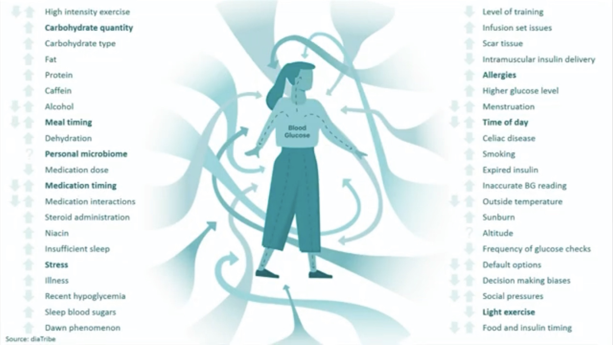
So how on earth do you display that on a phone app? And admit that there really isn't much precision here?
I worked on an Innovate UK project that answered this question, for the above context. And we came up with a few things:
- Mixing words and numbers helped. Turns out insulin has a "curve" where it builds to its strongest and then tails off. So we would tell them when the insulin was at its strongest and when it was wearing off. We would show these almost like an activity timeline and used words to describe what was happening, in a scannable way
- We found a way to show low precision in a reassuring way. For example, If we'd had a graph showing possible predicted blood glucose and stuck to a single line, or single number, we'd lose trust every time it would be wrong. So we used a percentile graph. And we didn't need to explain what a percentile graph was - we used colour to say "we think it's most likely to be here in 4 hours time, but it might even be between here and here". Basically a version of Show Your Working
- The pretty complex ontology devised internally to categorise and track events that could affect blood glucose or potential insulin dose was turned into a fairly human "Usually, when you do X, Y and Z, and on days like this, your blood glucose does this when you eat this food and take this dose of insulin". It took a lot of tweaking to get the volume of information right here - earlier versions of the app tended towards too much extra information. Strong understanding of the assumed Knowledge Graphs and Ontologies helped here, and a ruthless approach to setting aside the parts of the ontology that actually were best covered with one, human word: "Usually".
- We asked the users you are researching with to mock up what they want, but we treated that as research into their mental model, not a blueprint. If we'd done any of the drawings they'd given us, and we did try mockups of some, no one else would understood them as well as the person who put it together. It was almost like a little camera into their mind.
This was mainly about showing uncertainty without making it feel unsafe, and explicitly bringing in the user in the loop as part of helping them decide what to do, rather than pretending the software was the only answer.
The app IP itself has been bought out a few times so I can't easily share screenshots but they are google-able if you are interested.
Show your working to build trust

To extrapolate out "show your working" into more complex calculations and things like ML or AI... this looks less like a neat invoice and more like a stack of contributing layers. For a civil engineering example some layers could be:
- Legacy customer data that’s only accurate to ±50 m
- The tolerances in the measuring equipment providing the data
- The matching and assignment logic to existing surroundings
- A misunderstanding of something customer or situation specific
- A model or two on top
- Maybe even a bug or two
- Some processes around that eg human-in-the-loop QA.
These users in this example are trying to plan staffing, risk and compliance based on some newer more accurate scanning equipment, so they need to see what’s automated, what’s manual, and where the machine will reliably need human help. A simple error say at one of these layers can look catastrophic in the final output, putting doubt in all the layers, just by that number being very far from the user's assumptions of what the "regular" numbers look like.
Each layer can "draw over" or "fuzz" or "change" the final value or data in some way, like lines on tracing paper. This is a debugging mindset as opposed to a system design or coding mindset, because your users aren't designing the system, they're sort of debugging it with you.
For engineers and data people, this is often the uncomfortable bit - all the messy soft and hard systems colliding together. Without visibility of the layers, one bad input poisons trust in the entire system, and as you as the newly arrived software makers - you will most often be blamed.
So when something looks wrong, the key to preserving trust is being able to say something like:
"This part of the error comes from the legacy data, this part from our assignment rules, and this bit is a genuine bug."
The goal here isn’t defensiveness. It’s collaboration. To bring your user into your "human in the loop", like the diabetes app where the app can't know everything the user did that day, but it can still give what it knows to add to the user's decision making.
If you hide that attribution, all of the blame lands on “the AI” or “the system”, even when most of the problem is actually upstream - making error attribution legible here actually helps you here!
Often those 5000% from the real value cases turn out to be a single mis‑attributed input or mapping, not a fundamentally broken system - but users only discover that if you expose the layers, and let them do some of the sum in their own way.
Without that visibility, it just feels like ‘the whole thing is wrong’, and they will retreat back to whatever slower, manual method they still understand. This is your "trust threshold" broken, and when it's completely gone, it's extremely unlikely to come back.
The key distinction here is:
What users are really trusting is that your internal data model lines up with their reality, more than the last decimal place.
So proving them wrong here doesn't actually help you - even if you are correct!
This is true for highly numerate specialised users as much as someone using a music app.
Be kind if the user needs to change their mind

This "show your working" has an implied situation - what if the user made a mistake?
The key thing is understanding that their mental model also includes assumptions about themselves, for example, one might be:
"I am good at my job"
Finger pointing and showing the user they are wrong does not actually help your case, as they are then breaking the mental model about themselves.
I have anecdotally found this can be actually worse in highly educated and knowledgeable people who have a strong sense of reality and lots of knowledge to back up their internal worldview.
This is easier to handle in B2B, where they may blame another department instead of you, less easy in consumer software where you are the main thing they know about in the relationship.
So trust is sometimes not sharing hard truth and just telling them they are wrong - you need to break bad news in a way that they can consume.
In the diabetes app example, some of the diabetes data is self-entered - they might forget to log something and be in denial about it! A very normal thing to happen. But telling them they're wrong often does not work - you need to work around the reality of the world around you and give them the best info you have.
Remember this is not a blame game - this is you and your user collaborating via your software and data for your user to do something they want, need or are required to do - even if you never see them!
Taking this into your software
In safety critical settings, or areas like finance, opacity is actually a commercial risk - the customers (or at least the regulators) tend to expect upfront to know how things are done from their software providers. Various ISO standards and laws try to codify this for different sectors. Risks are: fines or people just no longer buying from you - they'll just assume your product is "crap". That's billion dollar markets gone... because someone thought it would be "too commercially sensitive" to explain how something was calculated.
In less safety critical settings, opacity is still a commercial risk in certain contexts, and you need to know your users to understand how much explainability you need. Things that up that need - complicated things that are difficult to explain, things that involve other people, things that matter a lot to the user if it goes wrong, things that go wrong a lot, and so on.
So you'll go through a phase of understanding just how much explainability they need, and you'll be tweaking this over time. So what does explainability look like? Even in the AI world where that "thinking" stage is more opaque?
Some general principles to help with explainability that aren't just "teach your users to code"
Whether you’re building enterprise tools, consumer apps, or internal systems, have some guiding principles:
- Every time you give someone data, or a UI component, or something else - you are adding to their mental model of how your system is creating this information. Everything you design needs to consider how you want their mental model to be in their heads.
- Remember that all these numbers or bits of data are Real Things to your users - they correspond to real life stuff those numbers represent, like their money, or the speed of a car they are inside, or how many minutes are they standing in the rain waiting for a taxi. Numbers being wrong are often scary.
- Your final "human in the loop" is your user. Try not to invoke them unless it helps them in some way.
- In addition, taking them on a journey to trust your data isn't a static thing - this takes time. Expect to be taking them on a journey of delegation (almost like delegating to a person), where they go from checking everything to just troubleshooting rare issues.
- You can however borrow patterns from other systems to help you. Don't reinvent the wheel (the diabetes example above, we literally did reinvent the activity rings on the Apple watch... but they made little sense to new users - was too much of an abstraction leap).
- Broadly, bugs are actually ok, as long as they don't break that mental model in your user's head. If you told them that you expect a variation of 5% and they spot something 5000% different from the number they expect, you need a good answer, and a clear one that makes sense to them.
- In addition, in the AI world, turns out the mental model doesn't have to show its pennies and nickels as long as it intuitively makes sense to the user, and the bugs don't break their confidence
- Balancing showing your working vs hiding detail will very much depend on your users and how they use your data. Engineers in enterprise orgs will want almost a close handed collaboration, even if you get it all right - the person putting on a spotify radio station at a party won't care exactly how you define music genres as long as you don't ruin their party.
To finish - trust in data and systems isn’t about correctness, even with highly system literate and numerate users. It’s about whether people can place your system inside their understanding of the world.


