Your tech native brain is (probably) blocking you from making great software


When I was a child, a long time ago, I used to play this game.
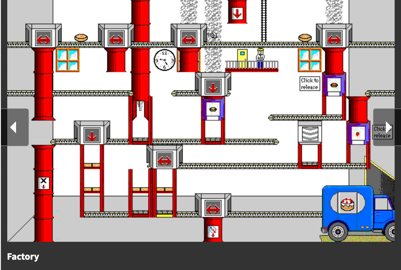
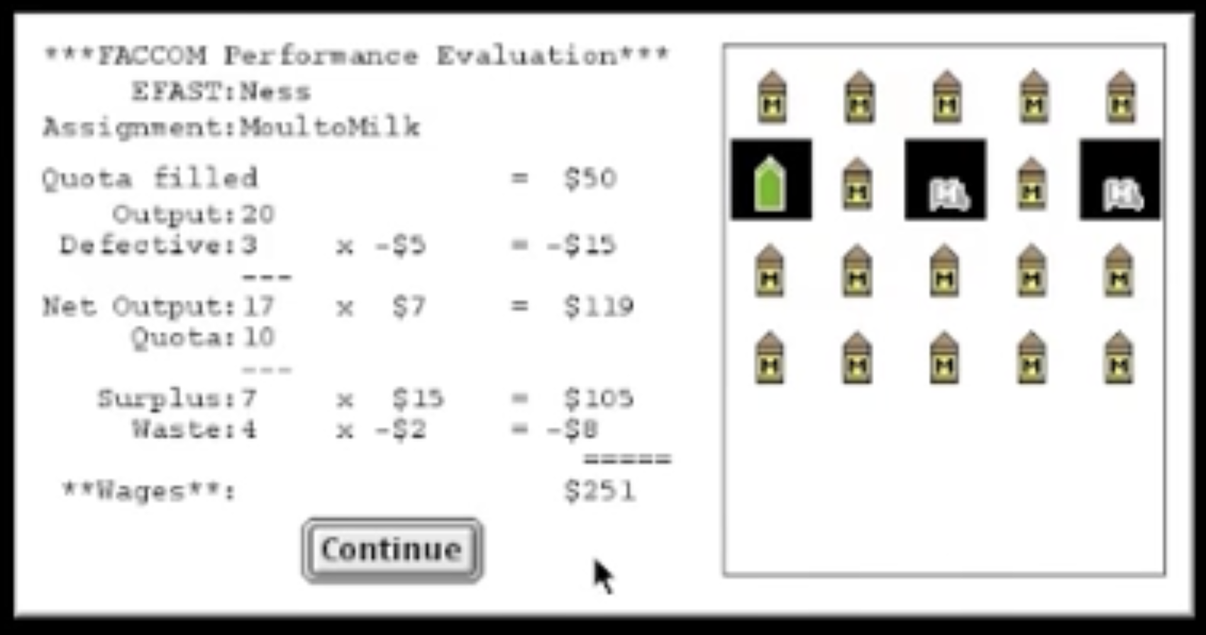
The goal was to successfully assemble a number of goods in a few minutes. Ingredients or parts would come out the top or side, and you'd have to process items and ensure they had all steps applied to them in the correct order - in this case, adding batter to a case, baking the cake, then decorating prior to them hitting the truck at the end.
Very satisfying when it worked.
And I’ve realised recently that this is also how a lot of software people internally picture systems.
Some other examples:
We build this sideways mental model:
inputs → processing steps → outputs
So we end up thinking in things like:
- data flows
- pipelines
- backend services
- transformation steps
- “what happens to the thing”
We can basically see the whole factory from the side. Even the Service Designers and Management Consultants do this! It's not just a coding thing.
Here's the catch. Like my childhood game, the user only sees the end result. Almost at the "edges" of those diagrams, looking in from the outside.
So in my factory game as a kid, you'd get this little screen at the end showing the products and highlighting the defective ones with a jarring sound effect:
And we end up with this to-ing and fro-ing where we can get confused that the user doesn't understand how to workaround their issue, or even what might be at fault. Because they didn't get to see the factory. They can only see the end result, from the edge of your clear diagram.
Why you can never be the user (even if you were one)
UX people have been describing this concept with great humour for years, in the hope we Finally Get The Damn Point. But the why and how of it doesn't get explained as often.
To help explain, an example. Startup founders who build a thing to solve a problem they had, or a company has recruited people from the customer domain into the software team fall into a common trap of thinking their view is still the same as the person they were before they made the product. They stop standing at the edge of the factory and start thinking in conveyor belts. Because they are no longer experiencing the product as an individual with no power - they now have visibility, and influence. They're "in the club" - they can request things, they can relate edge cases to "oh, Larry did that".
They also are actively incentivised to consider users as a group, not as individuals - the factory is the thing they see, read emails about, and contribute to every day.
That’s usually when the most important perspective disappears. We keep the basics of the domain expertise but lose the immediacy of the empathy.
How this applies to data, numbers or complex systems
With numbers or number based data in systems, this issue is even worse because a number on its own doesn't tell you how it was calculated. So both minor and major mistakes can make your number look completely ridiculous once they're "in the truck".
It's pretty easy to see that a cake is missing sprinkles, or a milk bottle is missing a label or the milk. It's really hard to tell with numbers whether the label is missing (hopefully trivial and fixable) vs the milk being replaced with orange juice (probably not fixable, needs a brand new milk delivery).
And most of my career has been in this space (high stakes data outputs with complex human systems around them), and this happens all the time. And ML and AI outputs have made it worse, not better, because they use lots of numbers/stats in their own way too. It's just our customers are calling them all "AI Bugs" now.
What we can do about this
The basics help: listen, build empathy, and give users a little more visibility into the factory — let them see how a number was calculated, not just what it is. I've written about that elsewhere and will expand on it.
But the most counterintuitive suggestion: when someone new joins your team, don't show them the factory first. Give them only what your users can see. Their confusion is gold dust. Capture it before the sideways view becomes permanent and they stop being able to see what your users see. Let them fail a bit.
Failing together is how we get better.


